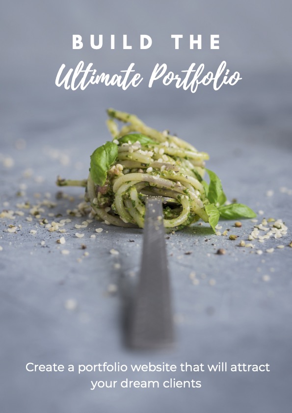
Build your food photography portfolio website
Even if you've never built a website before
So, you’re ready to build a stunning food photography portfolio website that will help you attract your dream clients.
Congratulations!!
It’s a super important step in your career and we’re excited for you!
If, like me, you’re really NOT the techie person, you might be wondering where to even start.
Which website platform to use? And how to create a good layout?
Is SEO something to eat? 🤔
Let’s answer all these questions and more.
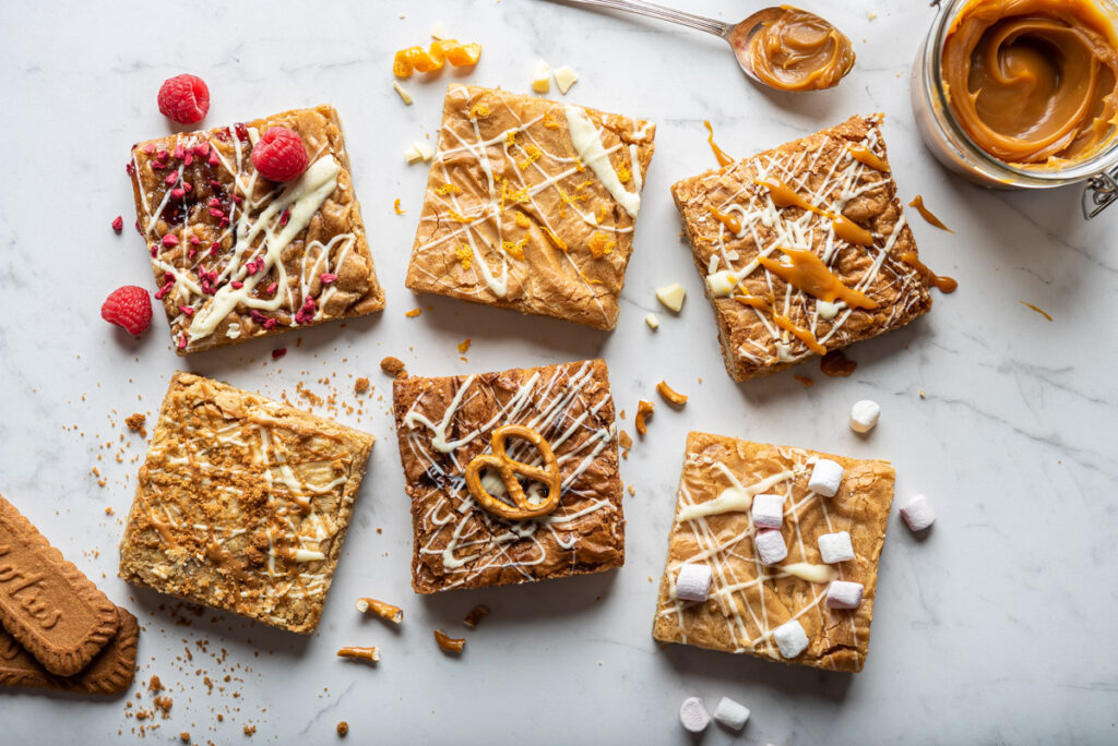
Step 1 - Choose a platform for your food photography portfolio website
Building your food photography portfolio from scratch doesn’t have to be overwhelming.
There are many plug-and-play, easy to use platforms and websites that are meant for this purpose and you can choose the best one for you.
These platforms will all host your website for you and some of them will let you customise your domain name.
In simple terms, these platforms will store your photos and your website for you and make it available to anyone on the internet who has a link to your website.

Best platforms to build your food photography portfolio website
First things first, let’s talk about the best platforms to use for your food photography portfolio website.
There are so many options out there, it can be overwhelming to choose just one. And one that is best for food photography!
Don’t worry, we break them down for you.
Here are some of the most popular options.
- Format: This is a popular choice for food photographers because it offers a clean, minimal design and a variety of templates to choose from.
It also has a built-in blogging feature which can be useful for sharing your thoughts and experiences as a food photographer.
It’s one of the cheapest platforms for beginners.
- Squarespace: Another popular option, Squarespace offers a variety of customisable templates and an easy-to-use drag-and-drop interface.
It also has a range of e-commerce options, in case you want to sell prints or other products through your food photography website.
It’s a little more pricey because of the e-commerce functionalities it offers.
- Adobe Portfolio: If you’re using Lightroom and Photoshop for your editing workflow (and you really should be!) you’re already a Creative Cloud subscriber.
Adobe Portfolio is a great option for you to start because it integrates seamlessly with Lightroom and Photoshop.
It also offers a range of templates and design options that are easy to use and customise.
And it’s included in the monthly plan so you don’t have to add another expense to your new business!

- Wix: This is a super user-friendly website builder with a wide range of templates and design options.
It’s a good choice for beginners who want an easy-to-use platform.
It gives you loads of tools for personalisation so it can get a little overwhelming but you can also use their templates as they are with minimal tweaking.
It’s also affordable, so it’s a good option to start. - WordPress: One of the main benefits of using WordPress is its wide range of customisable themes and almost endless plugins, which allow you to create a unique, professional-looking website with minimal website experience.
Our whole Food Photo Circle website is built using WordPress, for example.
It does require some more tweaking than other platforms but if you have some basic CSS coding skills and if you’re a bit more techie, the possibilities it offers are almost limitless.
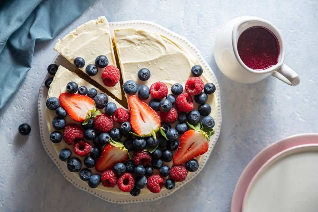
Step 2 - Choose your food photography website name
When you start your business, you want to choose a good name for your food photography portfolio.
When choosing a platform, consider paying a bit more to have a custom domain name, meaning you can personalise your website name.
On some of the cheaper pricing plans, the link to your website might look something like this www.yourwebsitename.platformname.com.
Almost all the platforms offer more expensive plans that allow you to personalise your website link and make it prettier (and more professional looking).
So you might end up with something like www.yourwebsitename.com

We recommend calling your professional food photography website something like www.yourfullnamephotography.com or www.yourfullname.com or www.yourfullnamefoodphotography.com or www.yourbrandname.com
For example, our website name is www.foodphotocircle.com because that’s our brand name.
My professional portfolio website is www.mynamemysurname.com
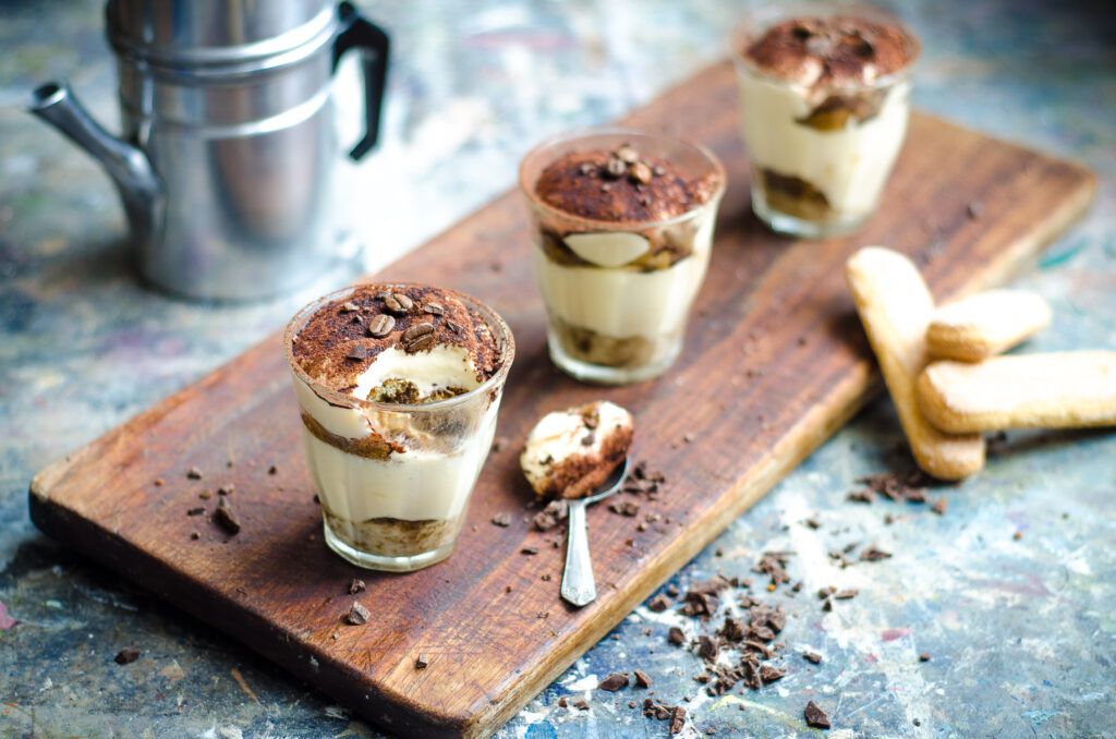
Step 3 - Choose a template for your food photography portfolio website
A simple layout and minimal theme is often the best choice for a food photography portfolio website because it allows your photos to be the main focus.
Most of the platforms we mention have great templates that are built for photographers so try not to overthink it and choose something that speaks to you.
The important thing to remember is that when a potential client lands on your portfolio, you want them to be immediately drawn to your work, and a cluttered or overly designed layout can distract from that.
Keep it simple and image focused!

A clean, minimal layout also makes it easier for viewers to navigate your portfolio and find the photos they’re interested in.
So for example if they are an ice cream brand, they can more easily spot those stunning gelato images you shot.
Overall, an uncluttered layout and minimal theme will help showcase your food photography in the best light (pun intended) and make it easy for viewers to enjoy and appreciate your work without distractions.

Step 4 - Optimize your images for SEO so you can be found by potential clients
Now, let’s talk about optimising your images for SEO (search engine optimisation).
SEO is all about making your website and its content more visible to search engines like Google.
Meaning, how to make sure you’re not a ghost on the internet.
You want your potential clients to be able to find you when they Google!

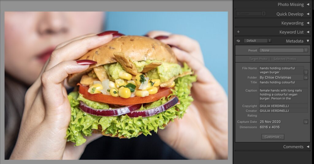
There are some tweaks that you can make in Lightroom before you export your photos to improve their visibility and their chances to be seen on the internet.
- Rename your photos and use descriptive, keyword-rich file names: Instead of using generic names like “IMG_1234.jpg” use a name that accurately describes the content of the image and includes relevant keywords for example “chocolate-cake-with-raspberries.jpg”.
- In the Lightroom metadata, make good use of alt text: Alt text is a short description of an image that is used by search engines to understand the content of the image. When adding alt text to your images in Lightroom, be sure to again use descriptive, keyword-rich language.
In this field you can be more expressive and give more details.
For example “Tiered Dark chocolate cake with milk chocolate frosting, decorated with raspberries and mint leaves on a cake stand on a marble background.”
Step 5 - Optimize your images to display them on your portfolio website
When you create your professional food photography portfolio website, you need to make sure that your images look their best.
You don’t want pixelated photos or photos that take 5 minutes to load!
When it comes to displaying your images on your website, it’s important to strike a balance between quality and file size.
You want your images to look as good as possible, but you also don’t want them to be too large, as this can slow down your website.

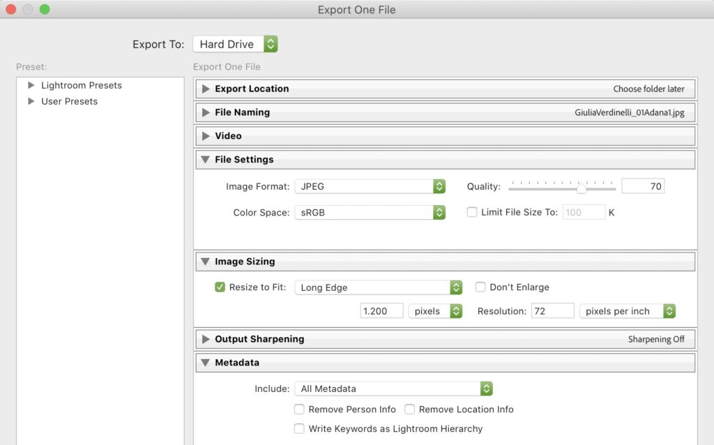
This is easily done in Lightroom – use the “Export” feature to adjust the size and resolution of your images before saving them.
A good rule of thumb is to save your images at a resolution of 72 pixels per inch (PPI).
This is the standard resolution for web images and will give you a good balance between quality and file size.
As for the exact Megabytes, it’s generally a good idea to keep them under 1 MB – between 400Kb and 700Kb is ideal.
This will ensure that they load quickly on your website and won’t take up too much space on your server.
Step 6 - Populate your portfolio website with your own images
Once you’ve chosen a layout for your food photography portfolio website, saved all your best shots in the right resolution and size and optimised them for SEO, it’s time to make your website pretty! 🌷
Often, platforms will have placeholder images that they use to populate the templates. This is the time to replace their stock photos with your own unique and stunning food photography.
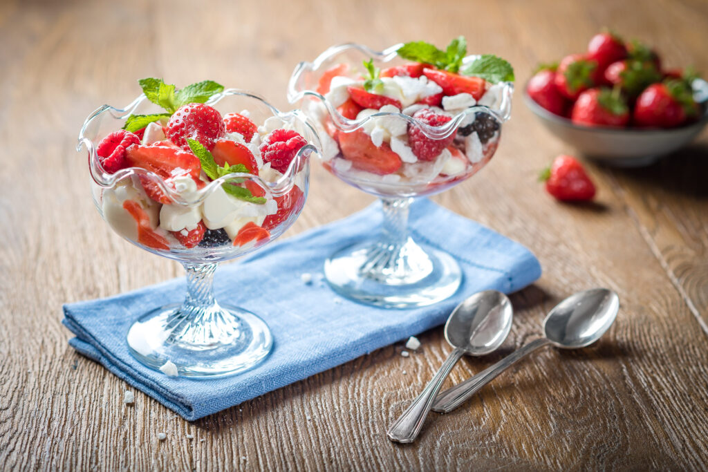
If you’re wondering what images to choose and how to arrange them, follow these tips to create a stunning portfolio layout with the right images in the right order.
Remember, creating a stunning food photography portfolio is a process in different stages.
Create a first layout and sleep on it. Then look at it with fresh eyes and keep tweaking it until you’re happy with the results and proud of it!
Step 7 - How to write the “about me page” on your food photography portfolio website
When you have done a first layout for your food photography portfolio, focus on writing an “about me” page that will make your potential clients want to learn more about you and your work.
Clients want to know who’s behind the lens so they can connect with you on a personal level!
First things first, think about your personal brand and what makes you unique as a food photographer.
What do you bring to the table (another pun intended)?
Think in terms of your unique style and the experiences that make you a good food photographer.

Keep it concise and to the point.
Tell your story in short, don’t start with “when I was 8 my dad gave me a film camera for Christmas….” and write your whole life story.
Aim for a couple of paragraphs that give a clear overview of who you are, what you do, why you do it and how you do it.
Talk about your background and highlight your experience as a food photographer.
For example, you might have worked in a professional kitchen, went to culinary school or had a baking blog.
Have you shot for any clients or publications? Have you won any awards for your work? Including this information can help establish your credibility and showcase your skills.
Another important aspect of your “About Me” page is your personality.
Remember, your portfolio is a reflection of you, so don’t be afraid to let your personality shine through!
Whether you’re a foodie at heart or a seasoned pro, be sure to let your passion for food photography come through in your writing.
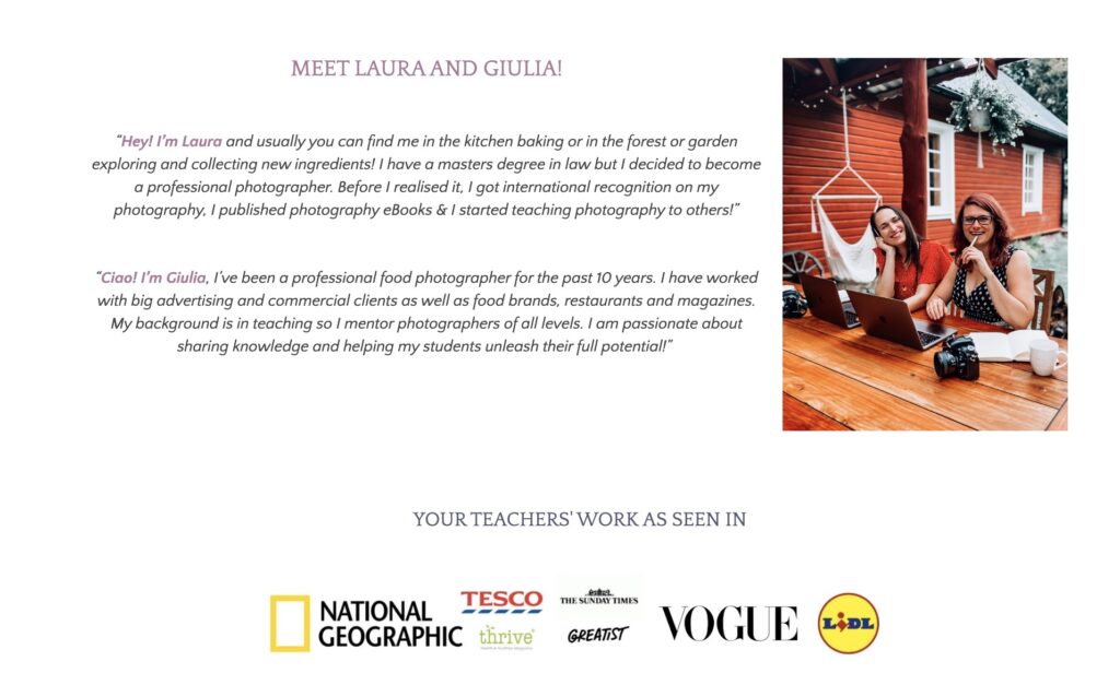
Have a look at what we wrote in our “about us” page and take inspiration 🙂
Step 8 - What to include in the “contact” page on your food photography portfolio website
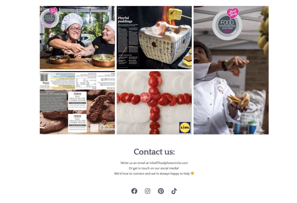
The aim of the contact page on your food photography portfolio website is for your potential clients to get in touch with you easily.
Easily is the keyword here. Make it super simple for them to access you and give them options so they can choose what works best for them.
Without overwhelming them!
Maybe a bit obvious, but be sure to include your contact information.
This should include your name, e-mail address, phone number and location (the city or country is enough).
Also important to include your social media handles!

Some photographers also have a form that potential clients can fill out to send them a message. This can help streamline the communication process.
Be sure to include fields for the person’s name, e-mail address, and a message box where they can type out their inquiry.
Finally, consider including a brief message on your “Contact” page that explains how you prefer to be contacted.
For example “I’m most responsive via e-mail, but feel free to give me a call if you have an urgent inquiry”.
This can help set expectations and make it clear for people on how to get in touch with you if they can’t choose between the options.
Step 9 - Get feedback on your food photography portfolio website
Arguably the most important step of all!
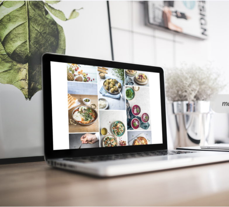
Getting thorough and constructive feedback on your food photography portfolio website will set you apart from your competition and make sure your website is top-notch before you show it to your clients.
Show your portfolio to as many people as possible. Start with friends and family but don’t stop there.
Share it with your colleagues, other food photographers, graphic designers, food stylists, art directors and people working in the industry and ask for constructive criticism.
The best feedback you can get is from professional food photographers.
They know the ins and outs of the industry and they have experience in what clients want to see in your food photography portfolio in order to hire you.
They are the best people to give you advice on every aspect of your portfolio, from technical feedback on your images to how to structure the layout.
From what images to include (or exclude!) and how to arrange them in galleries that make sense and will convince your potential clients that you’re the right photographer to work with.
Conclusion
Congrats!
You’re now able to build the ultimate food photography portfolio website and show it to your dream clients!
Whether you choose to use a platform like Format or Squarespace, or go the DIY route with WordPress, the important thing is to choose a solution that works best for you, your needs and level of tech expertise.
Be sure to keep your layout simple and minimal that puts emphasis on your images.
Images are everything!
Don’t forget to resize your images for website use and optimise them for SEO so your clients can find you on google.
It’s important to include an “About Me” page that shows your expertise and personality and a “Contact” page that makes it easy for your potential clients to get in touch with you.
The last step is getting feedback from professional food photographers so you can really create a portfolio website that showcases your food photography skills and helps you land your dream clients.
And don’t forget to have fun and let your passion for food photography shine through!
P.S. Make sure your DOWNLOAD OUR FREE PDF about building a portfolio!


